WNBA Expansion
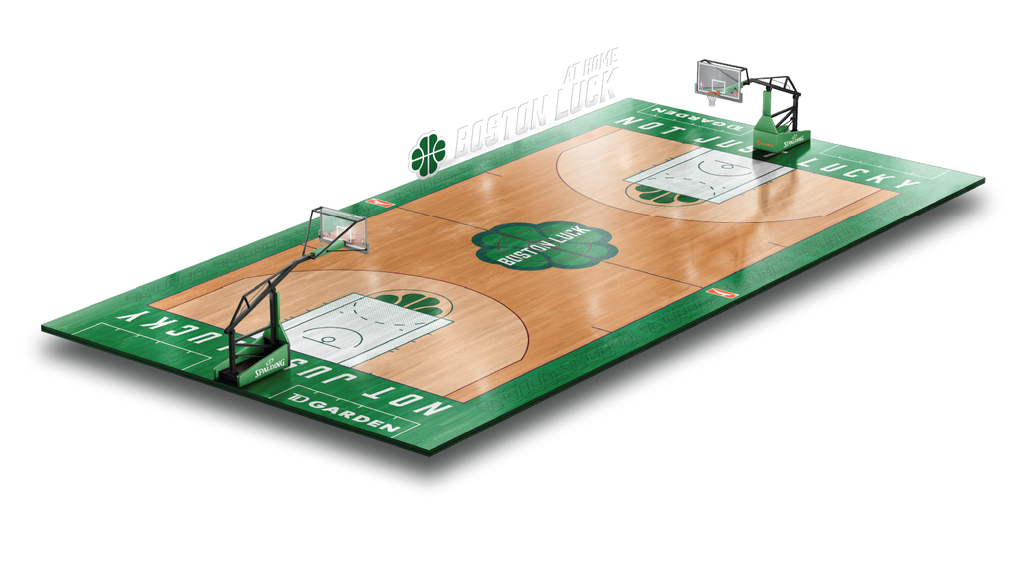
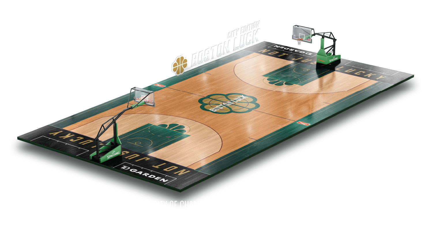
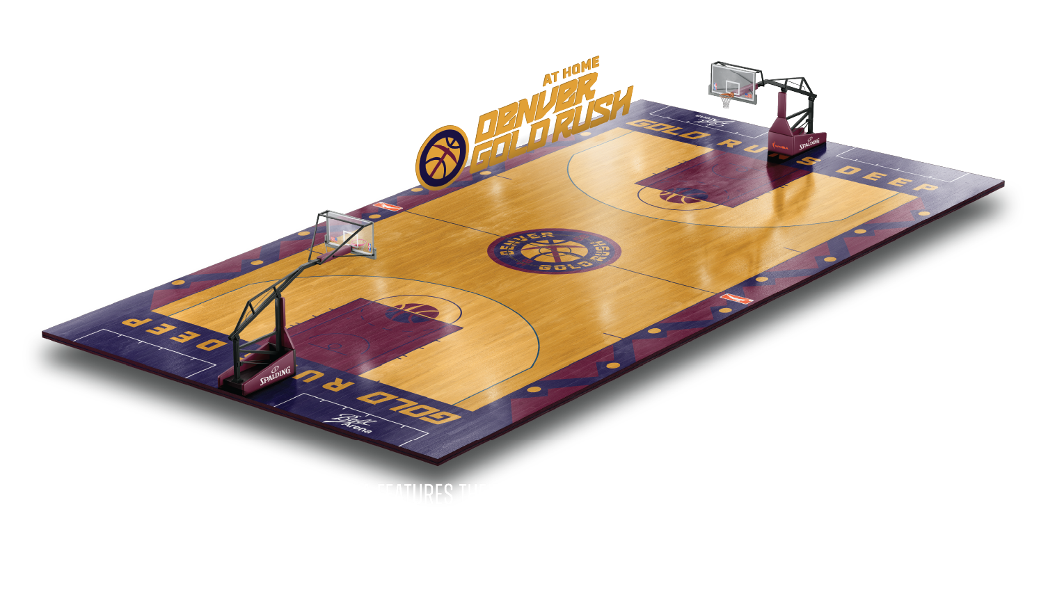
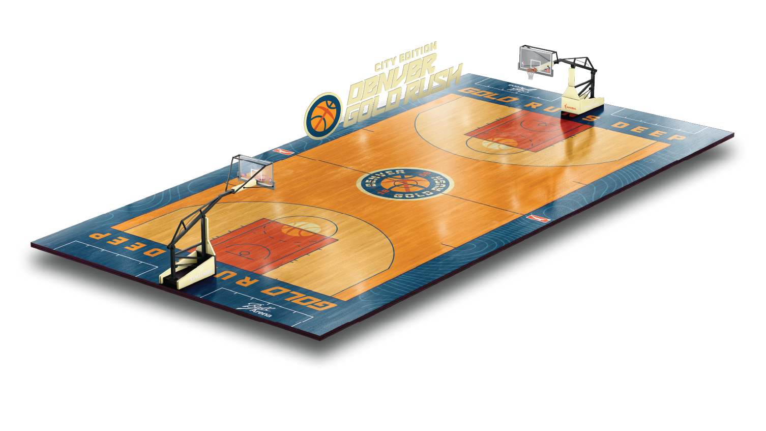
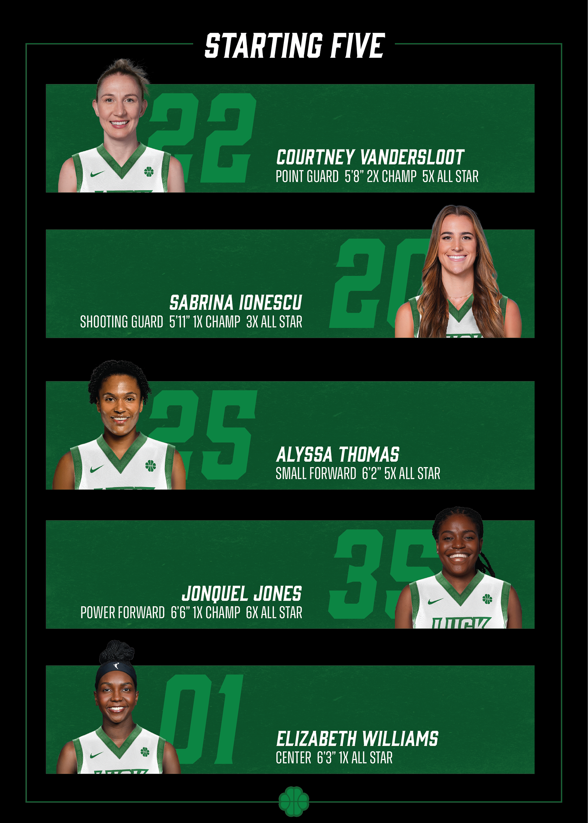
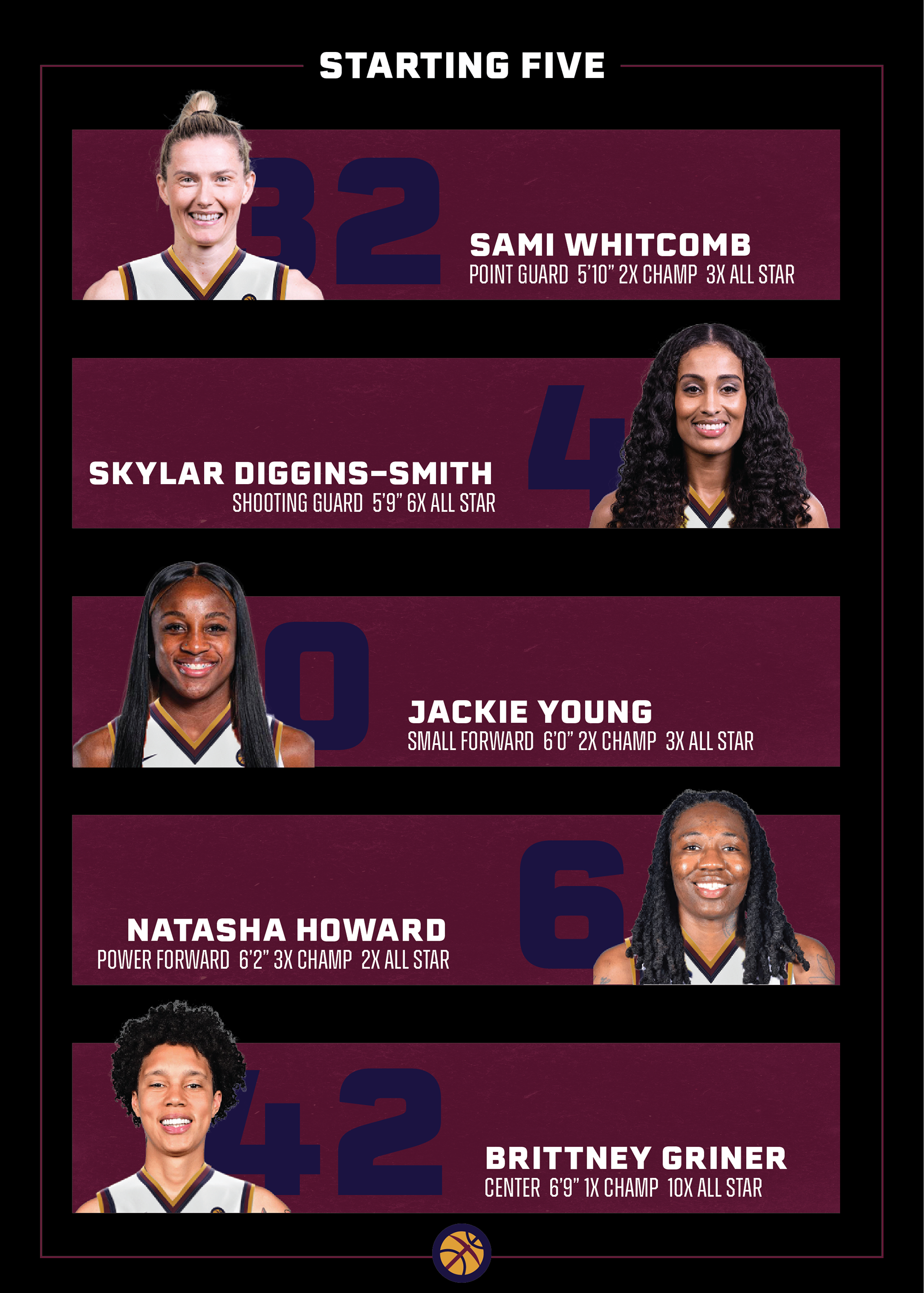
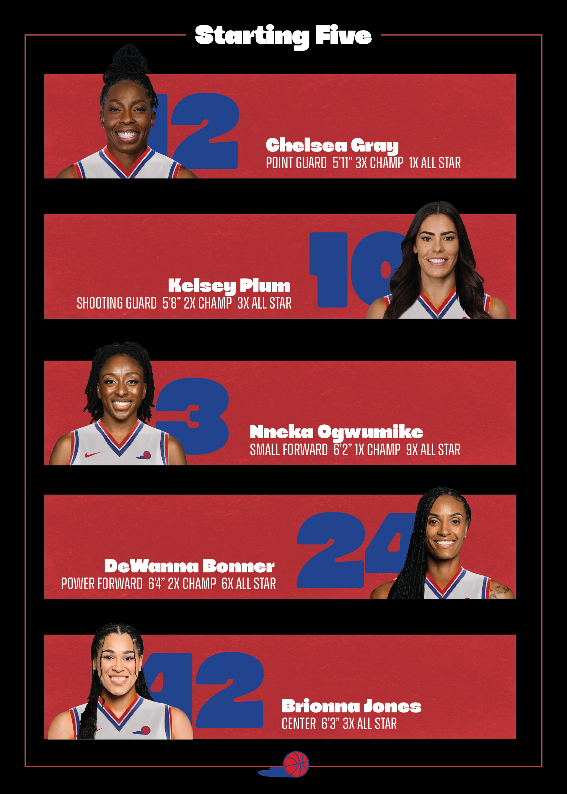
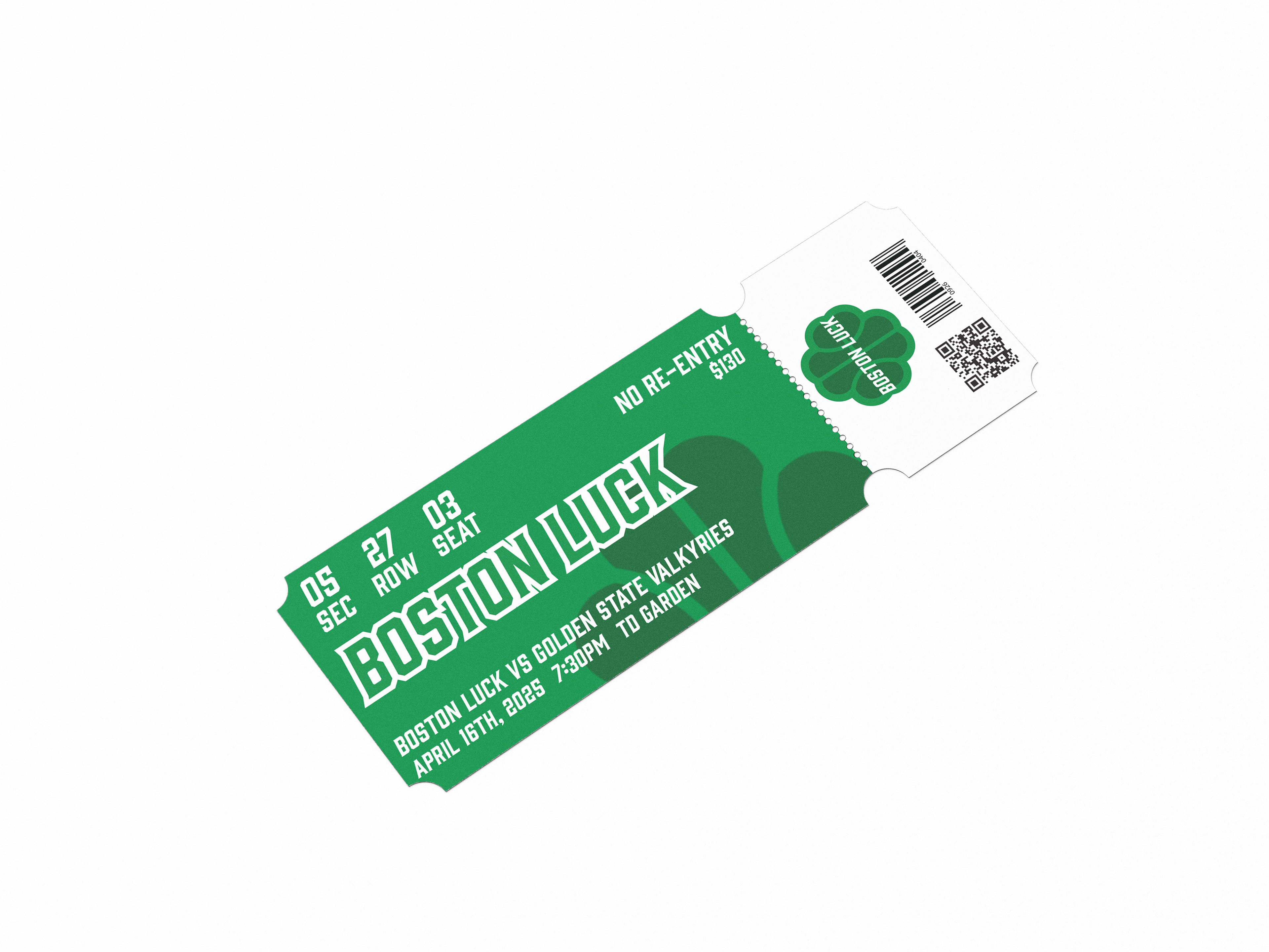
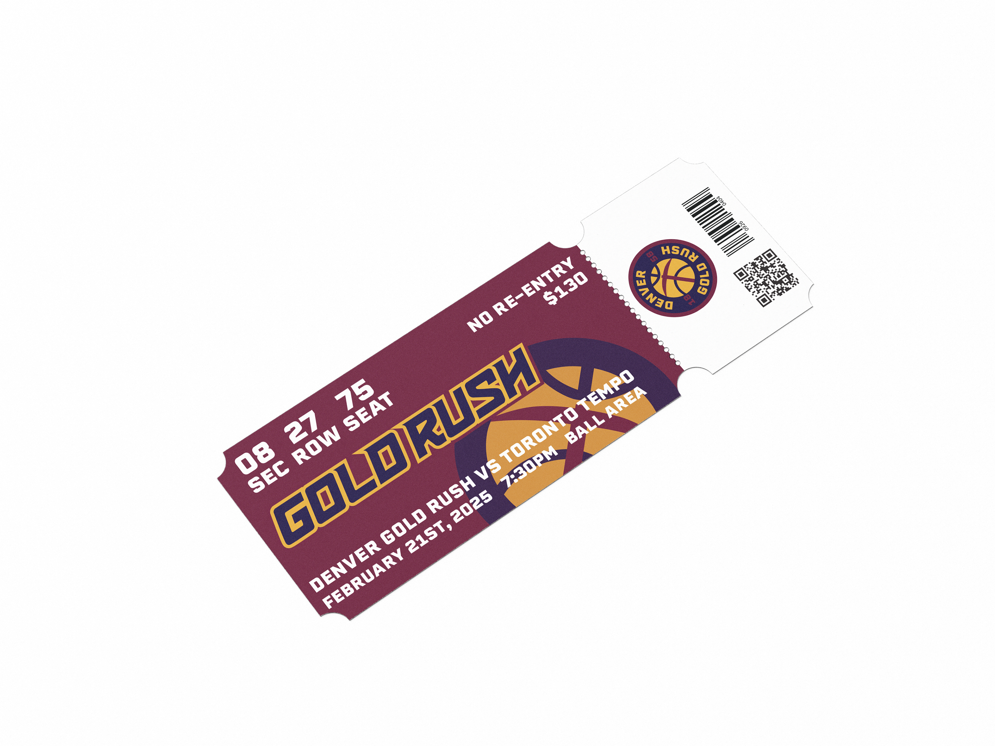
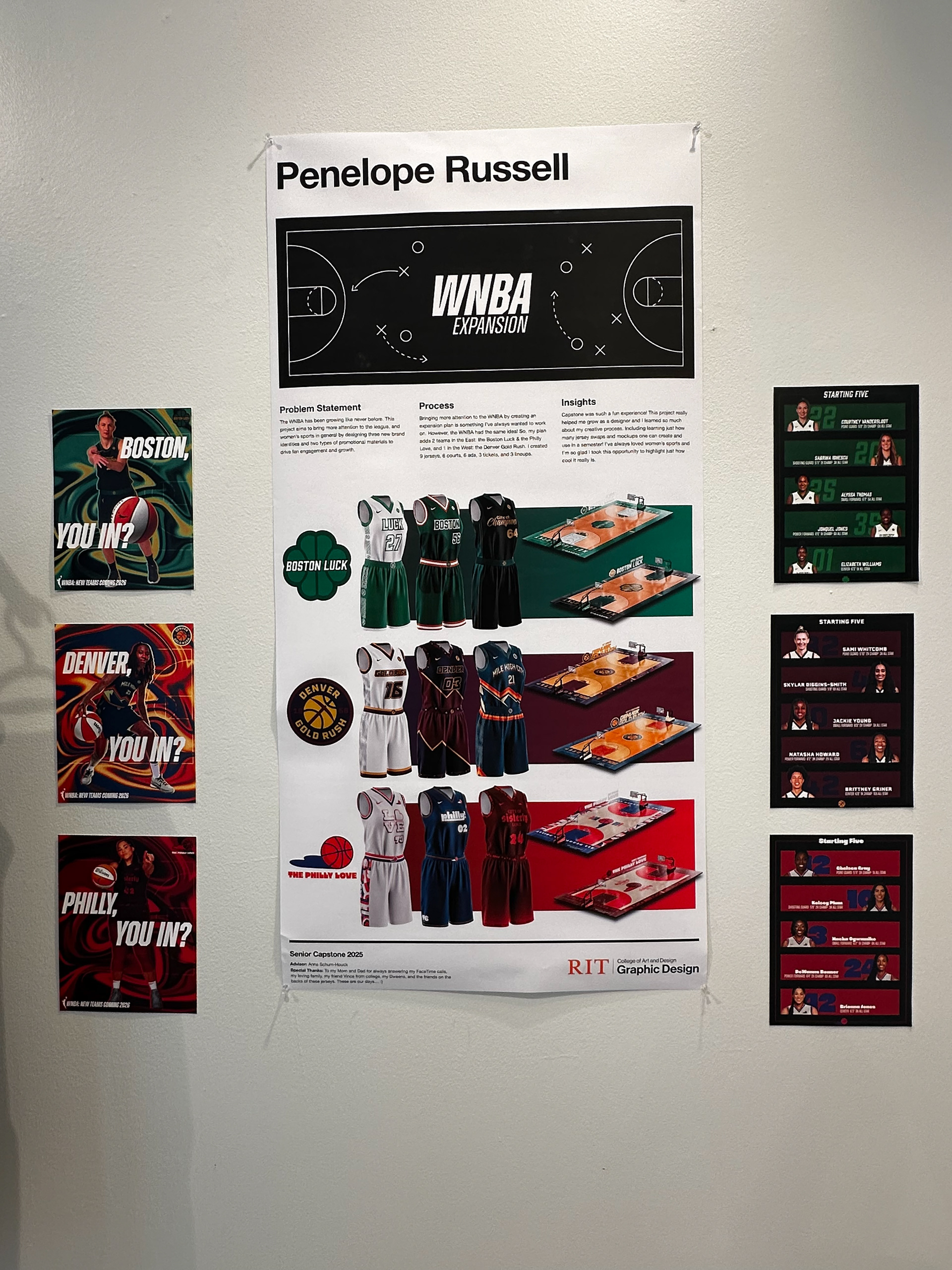
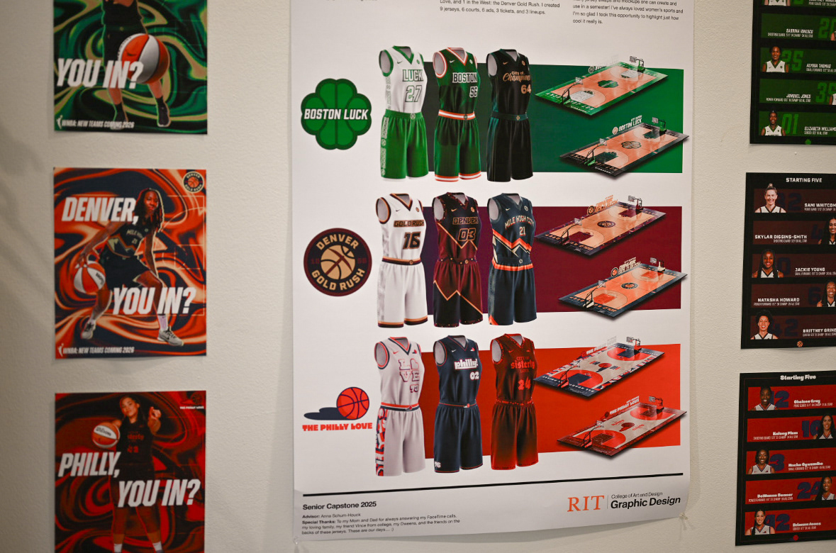
The WNBA has been growing like never before. This project aims to bring more attention to the league, and women’s sports in general by designing three new brand identities and two types of promotional materials to drive fan engagement and growth. This project adds 2 teams in the Eastern Division: the Boston Luck & the Philly Love, and 1 in the Western Division: the Denver Gold Rush. I created 9 jerseys, 6 courts, 6 ads, 3 tickets, and 3 lineups!
While most WNBA jerseys have color swapped versions for home and away, I wanted to focus on making as many unique designs as possible. So, I took each jersey as a new expression of its city!
(Not affiliated with the WNBA)
logos
the Boston Luck: a team with a legacy to uphold. the city of champions was my first choice to host the next wnba team due to the massive basketball and sports fan audience.
The denver gold rush don't mess around. a team thats as tough as its city. denver is the perfect host thanks to their highly passionate sports fans, large female population, and fast selling nba team.
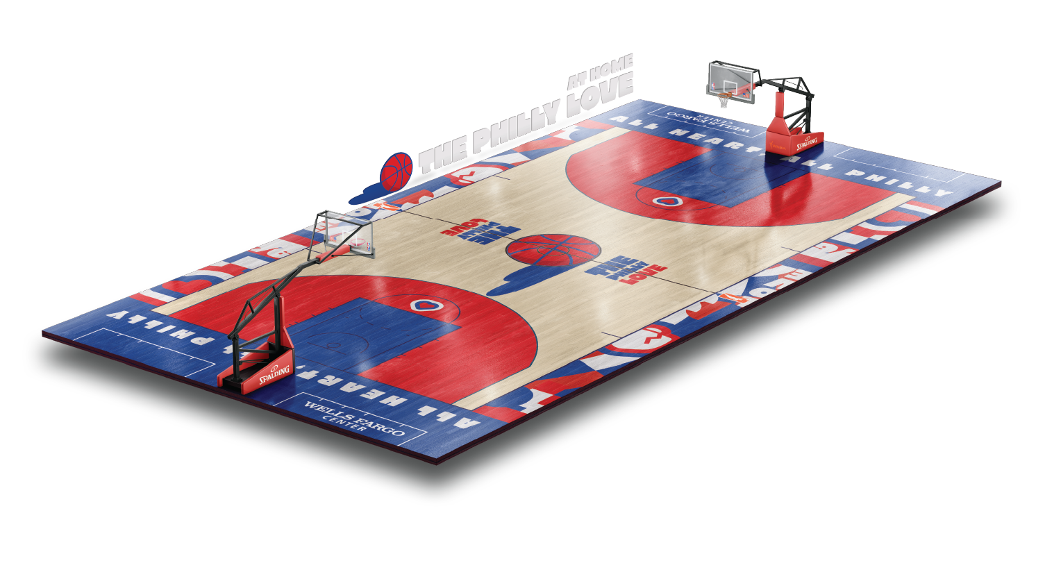
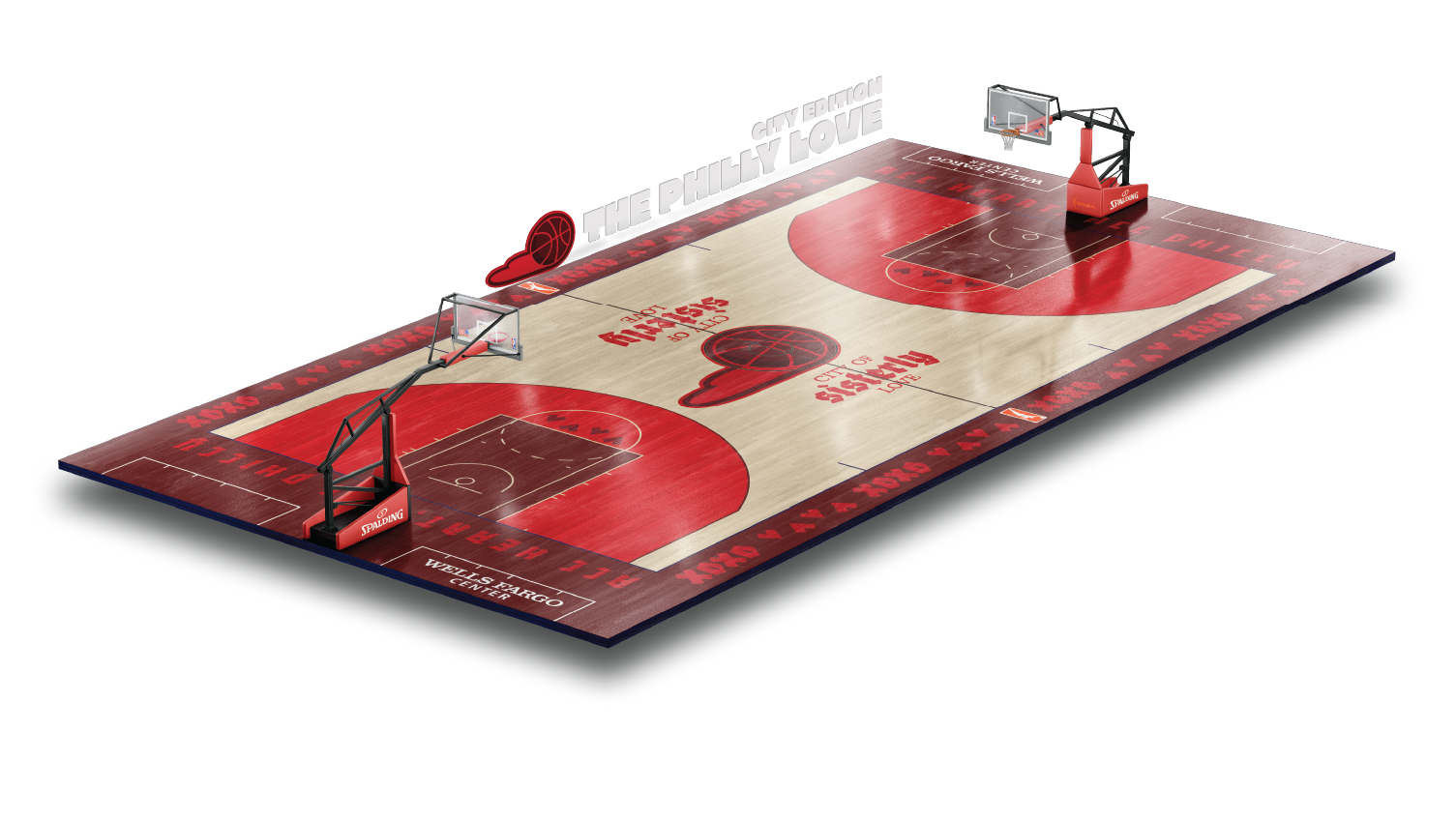
Nothing compares to that philly love. an unbreakable team the city of sisterly love can get behind. with one of the largest female populations in the country and some of the most passionate fans. Philadelphia has been ready for a wnba team.
jerseys
courts
print ads
This ad series is intended for print to drive excitement in each city. They each highlight a player who is well known in the WNBA community but may not be as familiar to those who don’t keep up with the WNBA. Each athlete in the series also reps their respective city jersey to get people pumped about new jerseys and a new team! These print ads are inviting, and draw viewers in through compelling colors and the movement of the athlete.
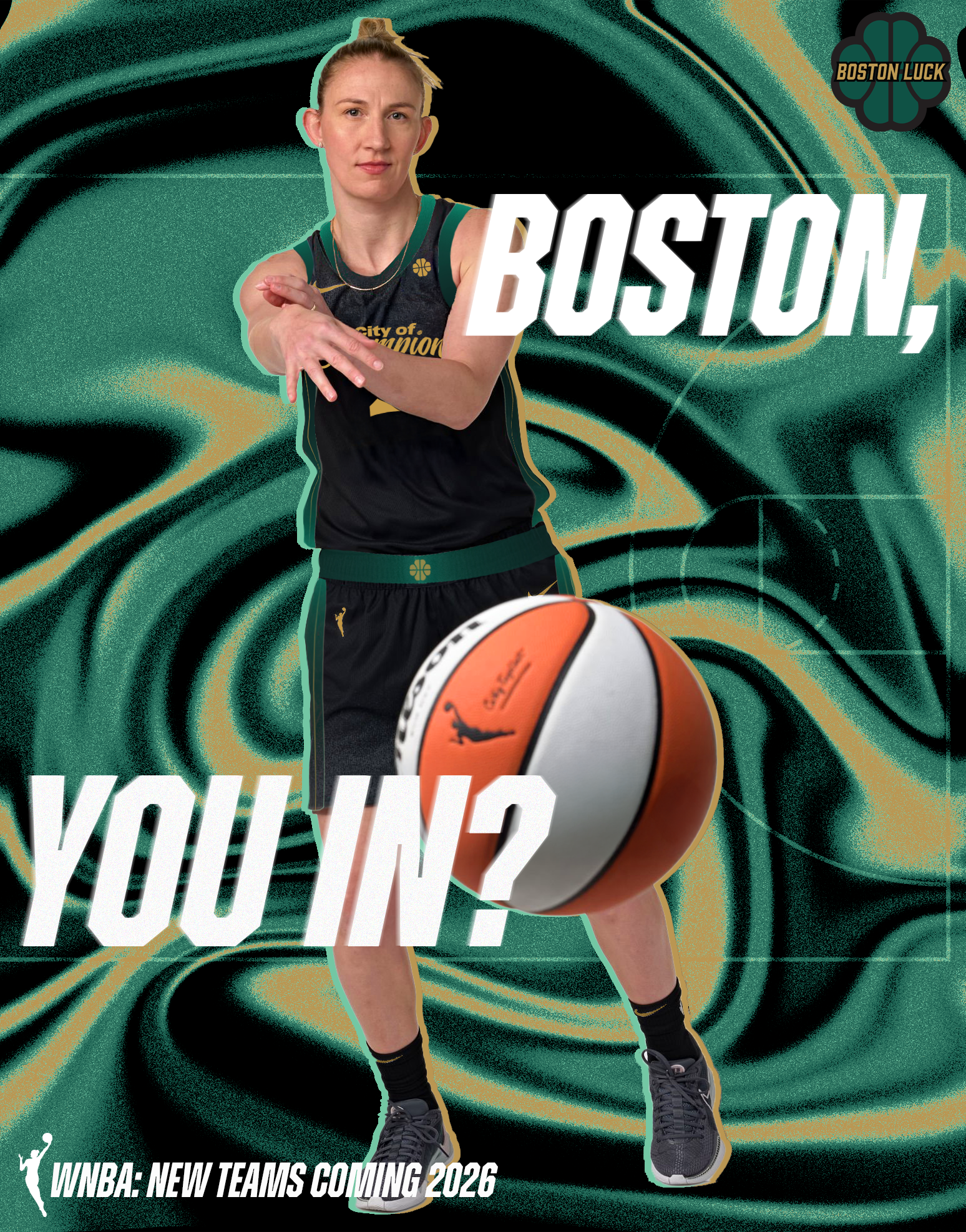
Courtney Vandersloot
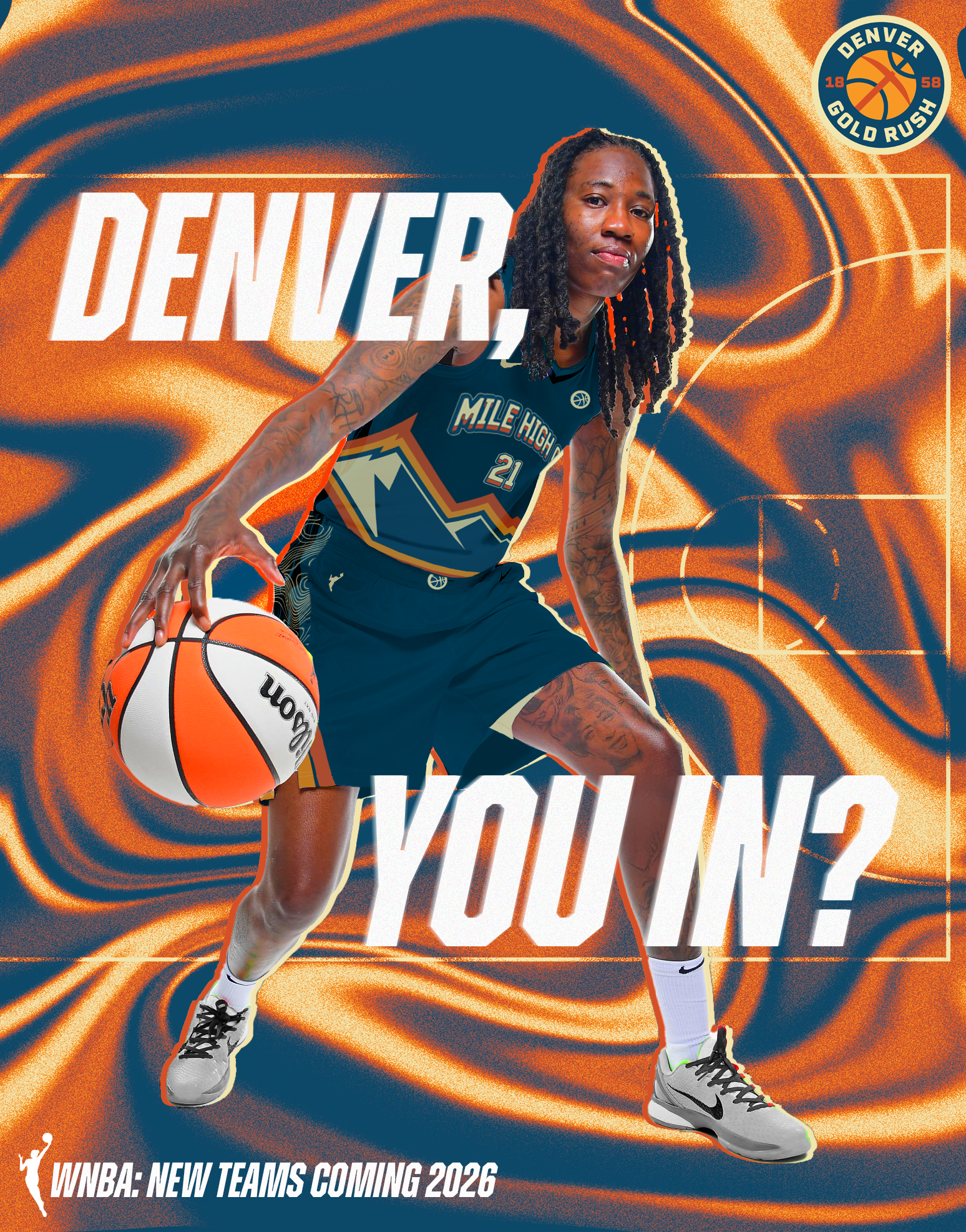
Natasha Howard
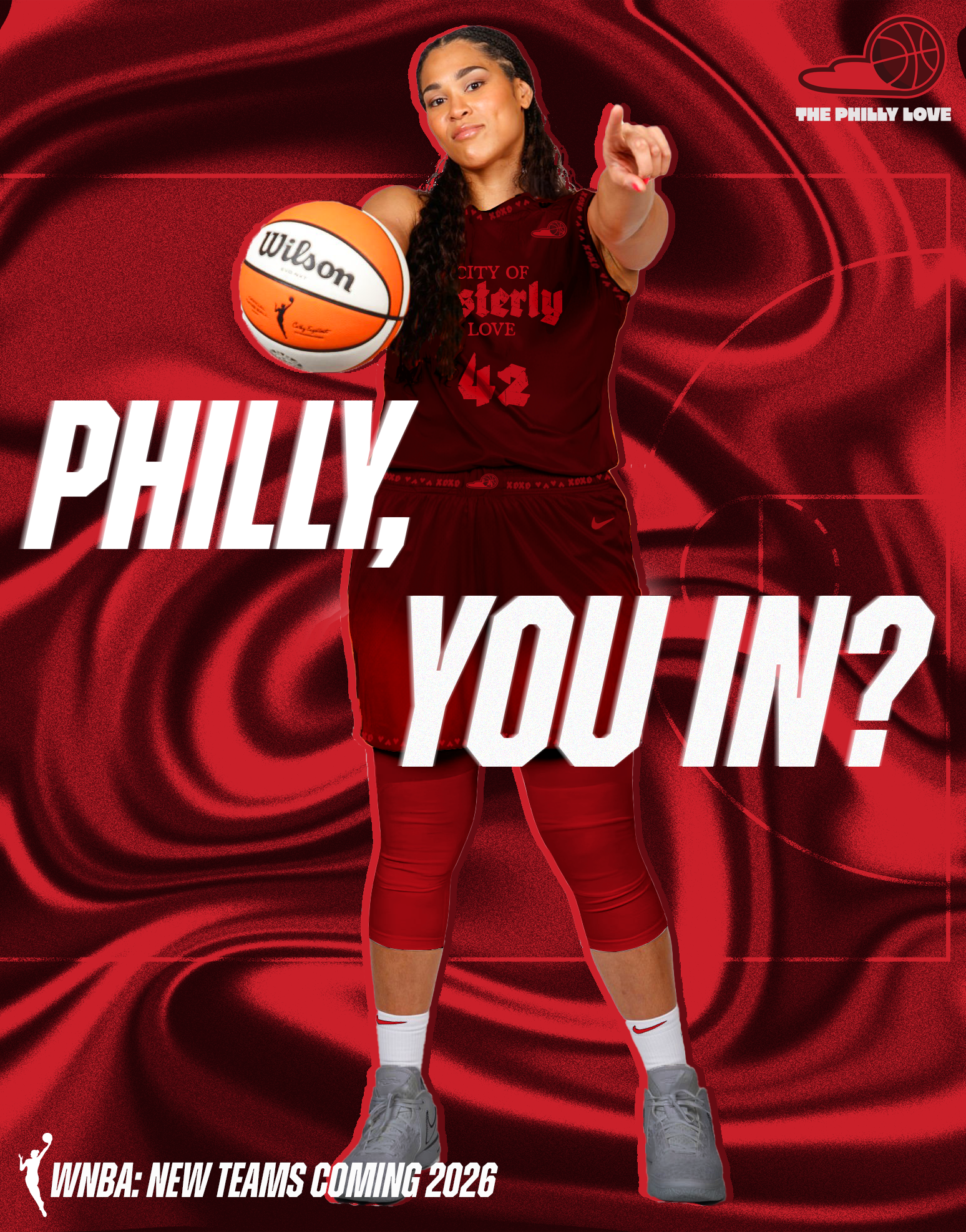
Brionna Jones
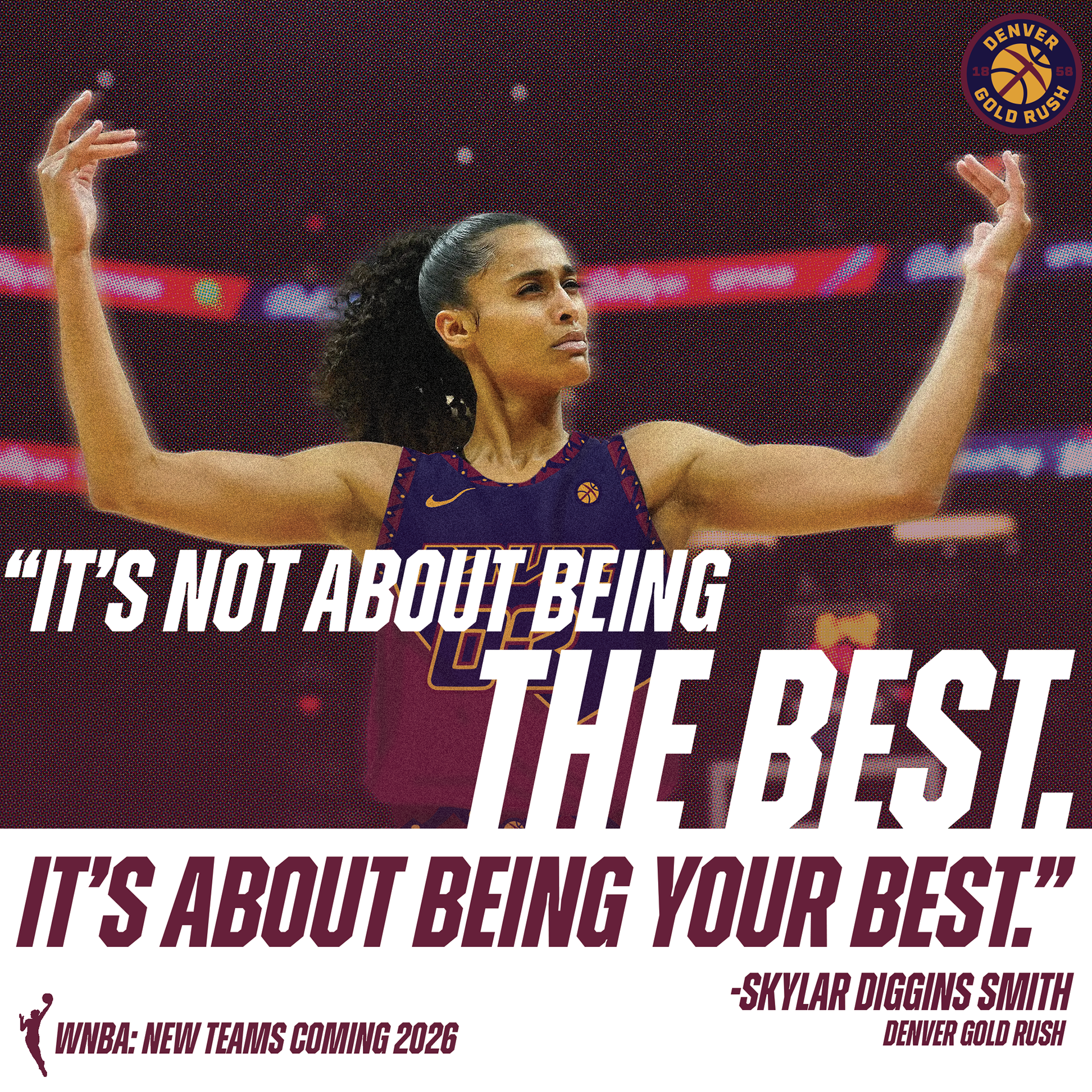
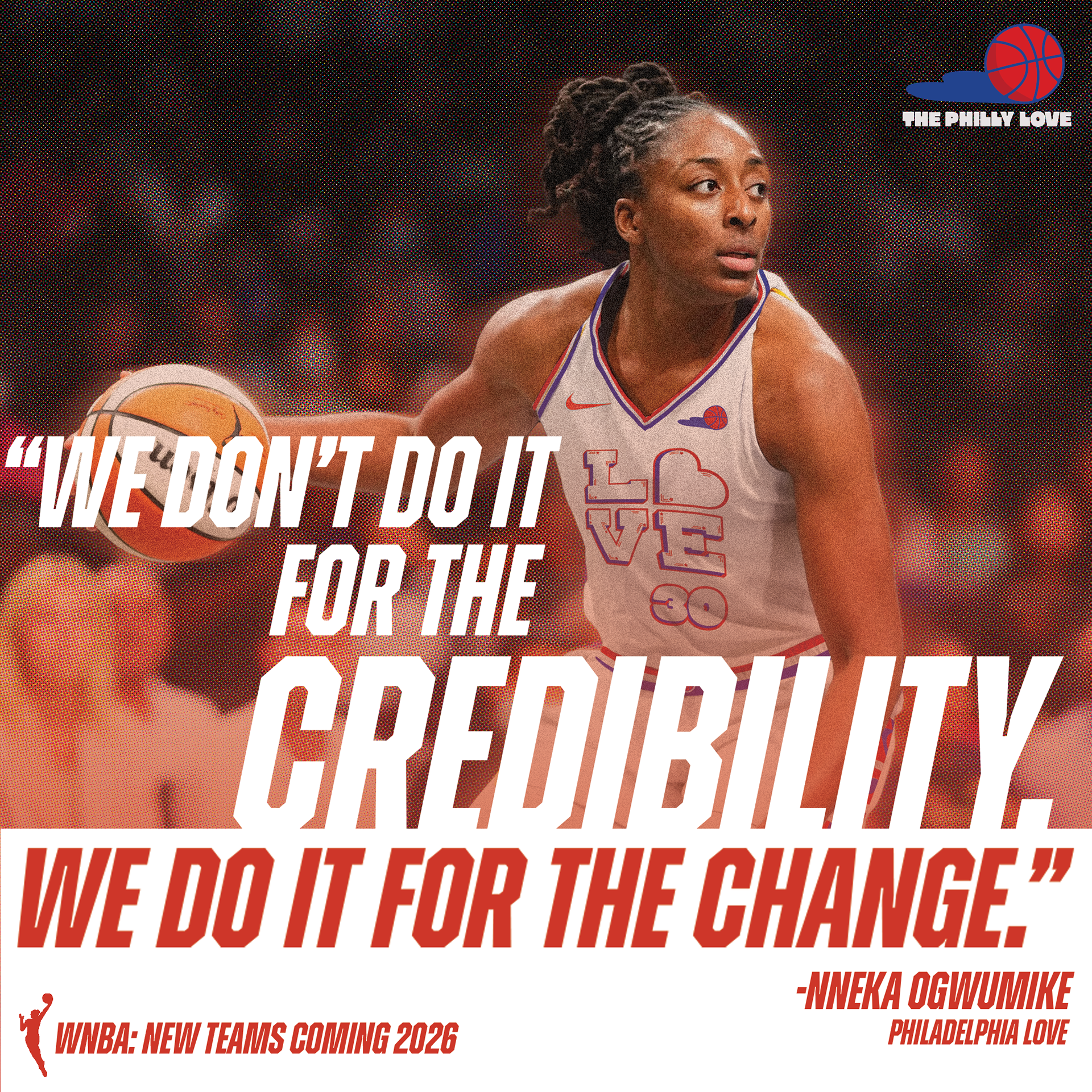
social ads
These ads are for social media and aim to increase overall attention to the WNBA. These women are so cool and they deserve their moment! They have a lot to say and do, so having a quote based ad series will help increase WNBA visibility and inspire people to start paying attention. These ads aim to inspire anyone, especially young women to get more involved in sports!

lineups
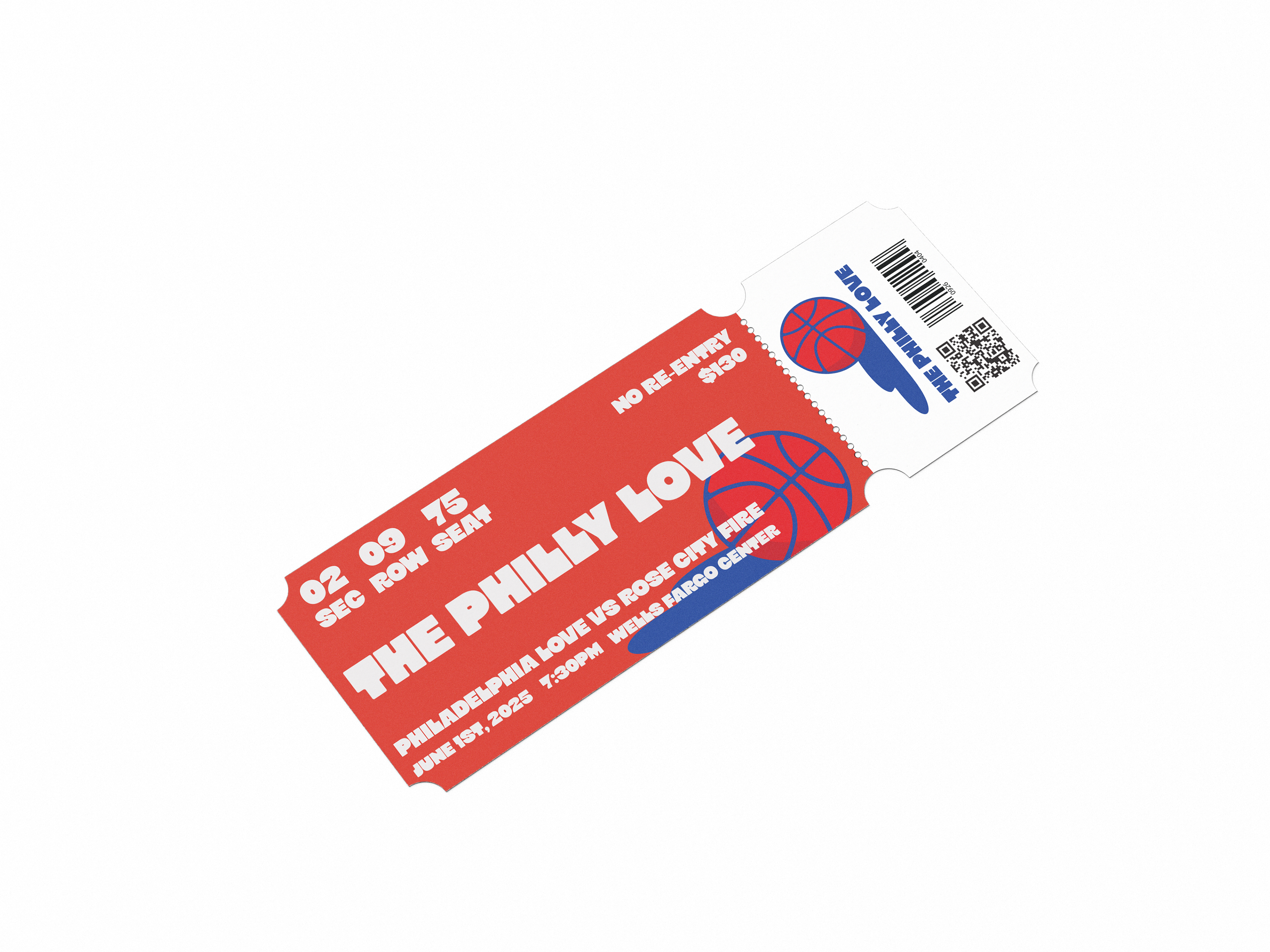
tickets
sketches
1. Original concept for a script based writing based on classic basketball jerseys, this later turned into the idea behind the City of Champions jersey!
2. A basketball with a shadow of a four leafed clover, which inspired the Philly Love logo.
3. Early sketches for the Boston Luck logo combining a basketball and clover.
4. Concept testing a logo with a hidden "B" and "L".
1. Early sketches for the Love's home jersey design. The amount of stars in each letter of this art totals up to 13 for the 13 colonies.
2. Early script logotype aimed to pay homage to 70s style art.
3. Liberty bell sketch features a ball inside the bell, and the crack in the heart acting as the "P" in "Phila".
4. Philly art highlights script style while incorporating hoop imagery, but was too similar to the Phillies to move forward with as a concept.
1. First logo concept for the Gold Rush, features Denvers beginning in 1858, and a pickaxe inside the basketball for the gold rush.
2. Denver logotype created by customizing a typeface by House Industries.
3. Initial sketch for a variation of the Rush logo with a shovel, also for the gold rush.
4. Early rendition of the jersey trim pattern with the Rockies.
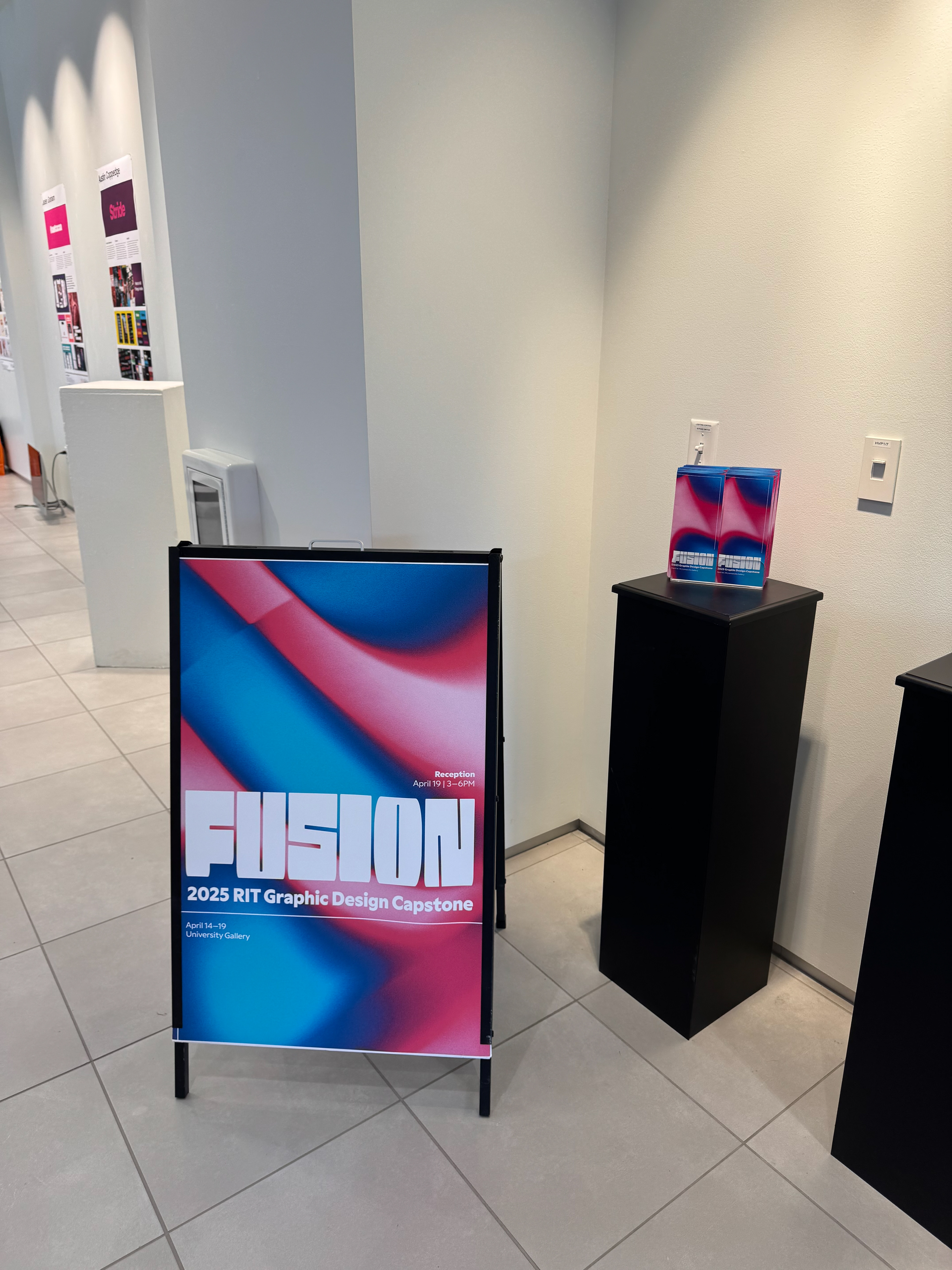
capstone gallery show
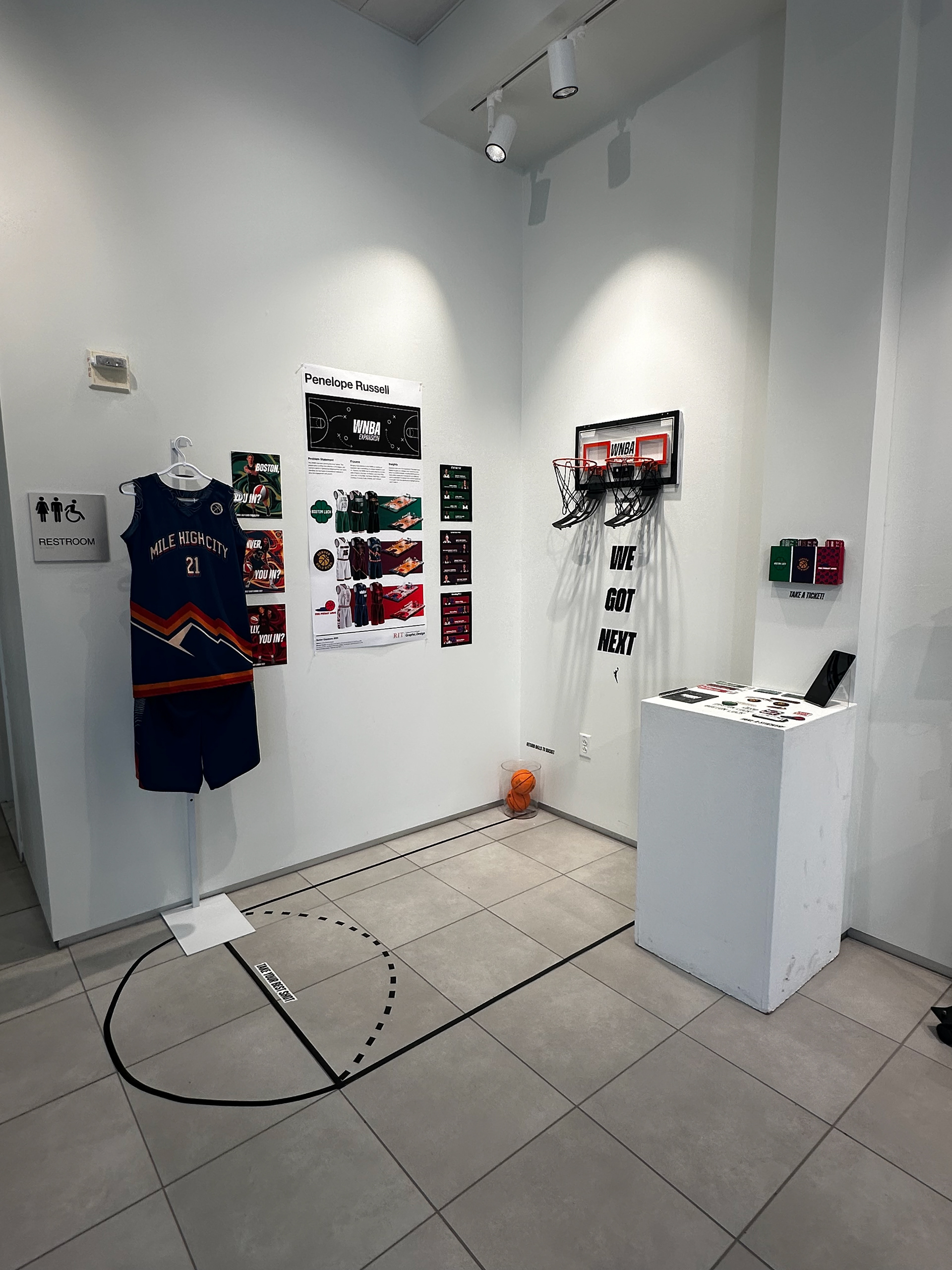


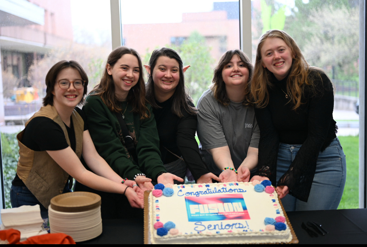
Special thanks to William Colgrove, Anna Schum-Houck, RIT GD Class of 2025, Olivia Licameli, Hannah Archer, Zoe Kontoleon, Nilda Castañeda and Lizzy Noe. These are our days :)

