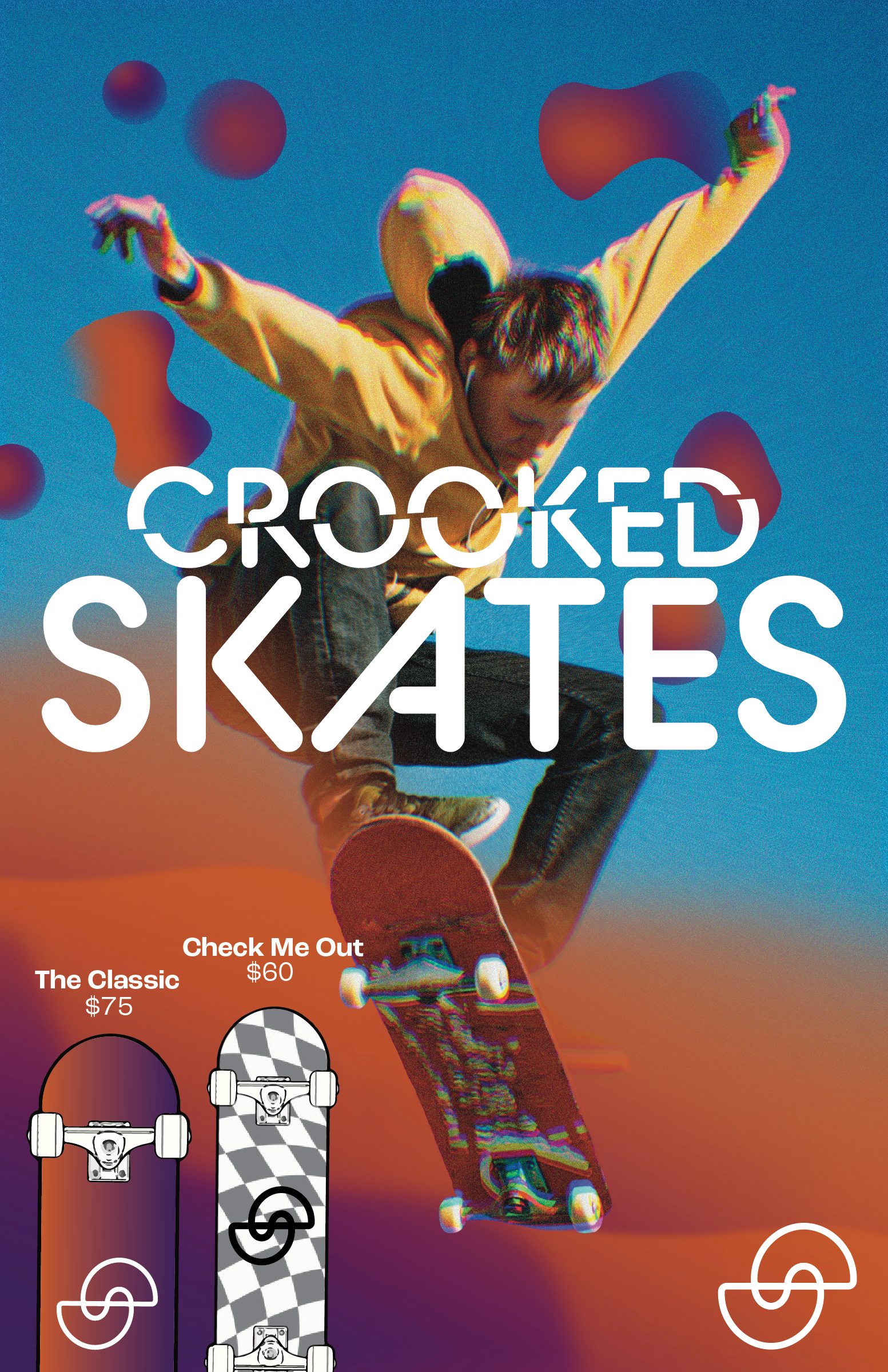
DESIGN CHALLENGE
This design challenge gave me the opportunity to learn more about my creative process, and see just how much I can create when limited to a certain amount of time!
THE BRIEF
Design a 1/2 page ad, 8.5” x 5.5” for an ad for a new skateboard company called
Crooked Skates to be featured in Thrasher magazine. The ad will be for a line of
skateboards. Full bleed and full color . Audience: 12-24, mainly men but
gaining more women each year . CTA: buy Crooked Skates skateboards. Time goal 1-1.5
hours.
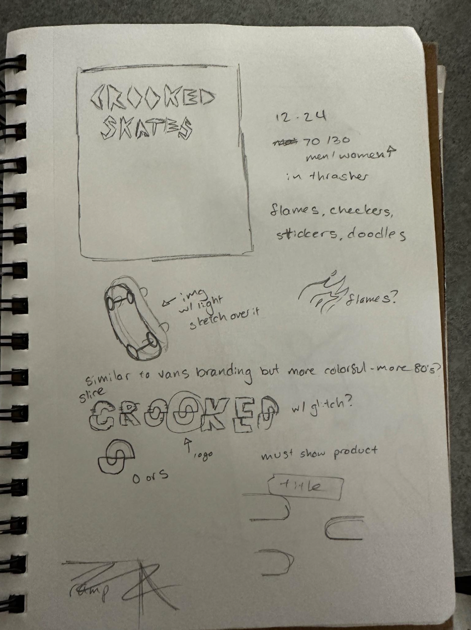
SKETCHES
My process began with creating the vision of the Crooked Skates brand. I started with the main type, which is where I found my logo of a slice "O" that also looked like an S for skates. I then created the layout that highlighted the company and its products.
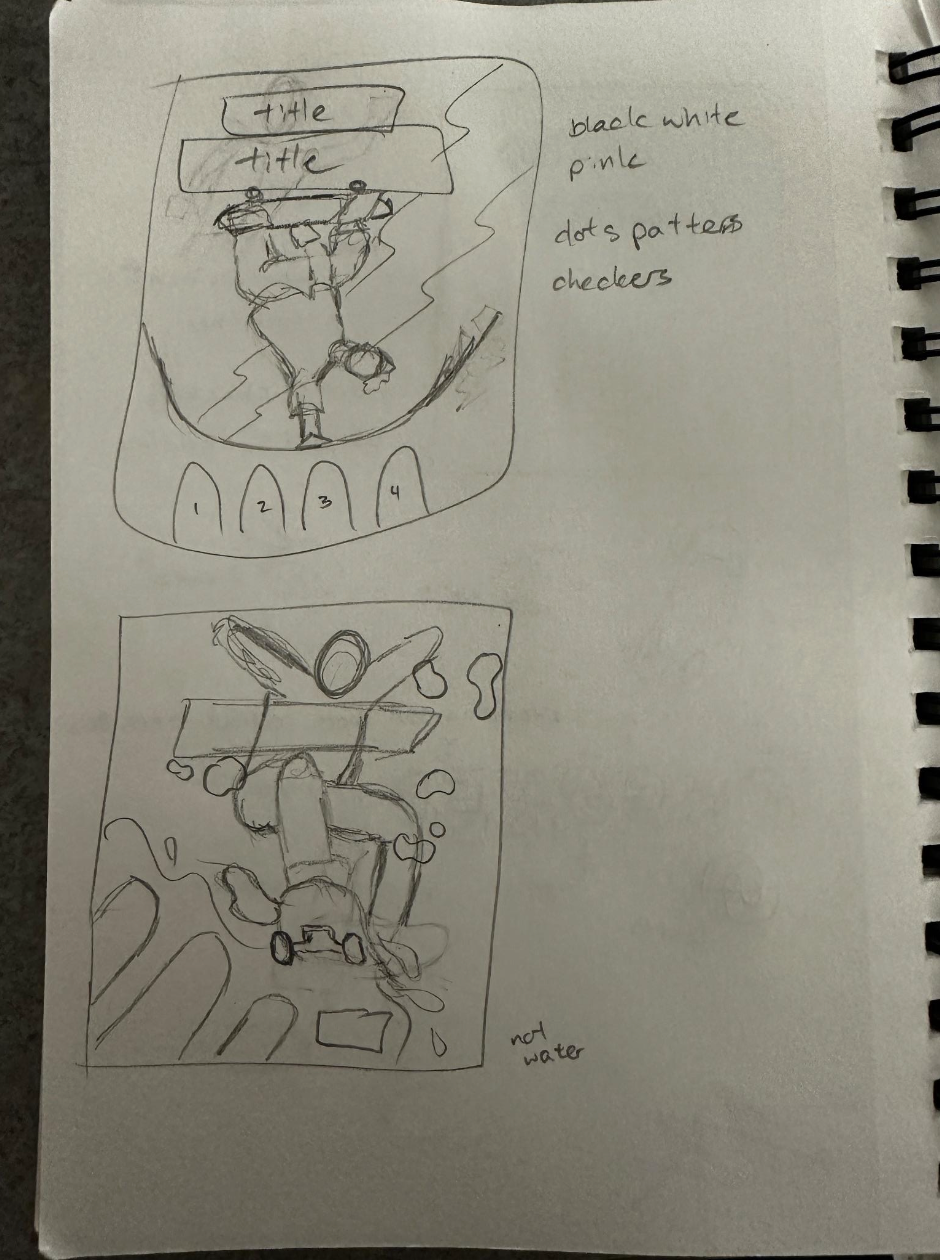
DIGITAL PROCESS
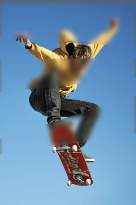
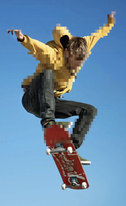
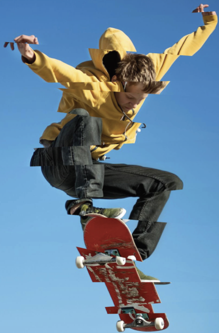
After choosing my composition, I first worked with the imagery, choosing how I wanted the main figure to look. I liked the idea of making the figure choppy since it matched the brand image I had in mind, but I felt it was too disruptive to the balance of the composition. I then look a more illustrative route making sure the blobs didn't clash with the imagery. I really liked the fluid gradient imagery and I felt it complimented the assumed movement of the figure.

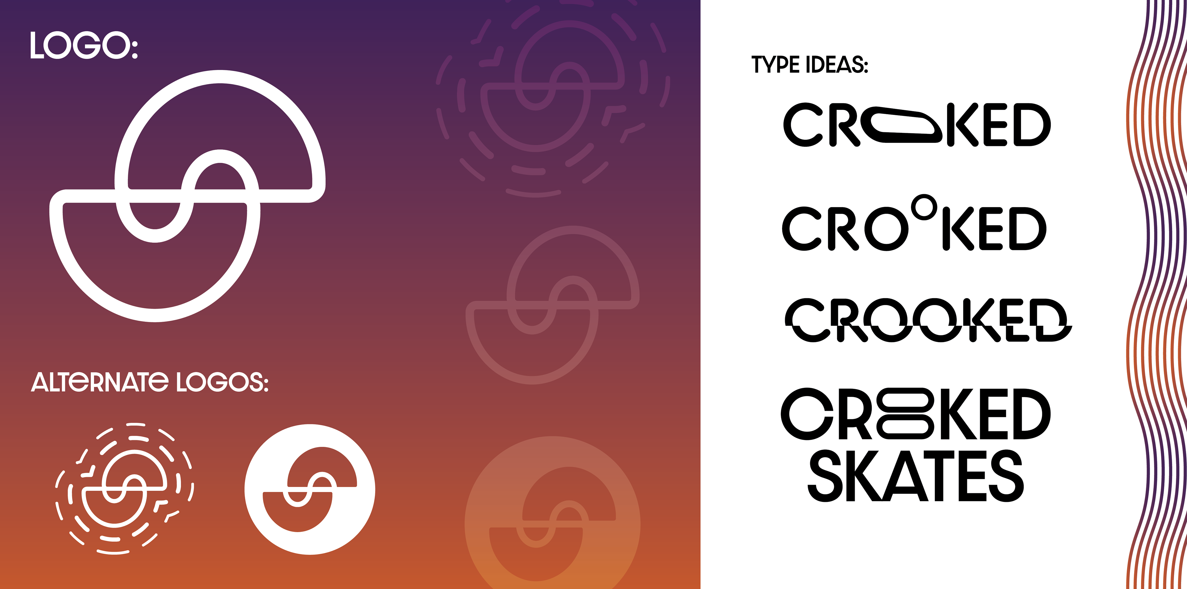
LOGO & TYPE
The type (BC Alphapipe) came to me the fastest in the whole process, but I still wanted to experiment with different iterations of the tagline. Creating the logo was actually the first step in the sketching process and I even worked with some alternatives for the brand. Lastly I added the products and secondary type (Roc Grotesk) and added patterns I felt were similar to the brand.
FINAL PRODUCT